Styling Buttons and NavigationLinks with ButtonStyle in SwiftUI
SwiftUI gives you a couple of protocols you can use to style your buttons:
Button {
    print("pressed")
} label: {
    Text("DefaultButtonStyle")
}
.buttonStyle(DefaultButtonStyle()) // the default style that gets applied

Button {
    print("pressed")
} label: {
    Text("PlainButtonStyle")
}
.buttonStyle(PlainButtonStyle())

Button {
    print("pressed")
} label: {
    Text("BorderedButtonStyle")
}
.buttonStyle(BorderedButtonStyle())

Button {
    print("pressed")
} label: {
    Text("BorderlessButtonStyle")
}
.buttonStyle(BorderlessButtonStyle())
But what if you don’t like any of these built-in styles?
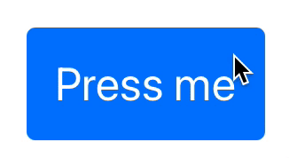
You could declare a bunch of styles inline like this:
Button {
    print("pressed")
} label: {
    Text("Press me")
}
.padding()
.font(.title)
.foregroundColor(.white)
.background(Color.pink)
.cornerRadius(5)
But doing this for all the buttons in your app is repetitive and annoying.
Also, if you want to control how the background color changes when you tap on the button, with what we have above, you don’t see any way of doing so 😨.
Enter ButtonStyle Configuration
You could centralize all these modifiers into a ButtonStyle configuration like this:
struct ContentView: View {

    struct PinkButtonStyle: ButtonStyle {
        func makeBody(configuration: Configuration) -> some View {
            configuration.label
                .padding()
                .font(.title)
                .foregroundColor(.white)
                .background(configuration.isPressed ? Color.blue : Color.pink)
                .cornerRadius(5)
        }
    }

    var body: some View {
        Button {
            print("pressed")
        } label: {
            Text("Press me")
        }
        .buttonStyle(PinkButtonStyle())
    }
}
ButtonStyle Configurations with NavigationLinks
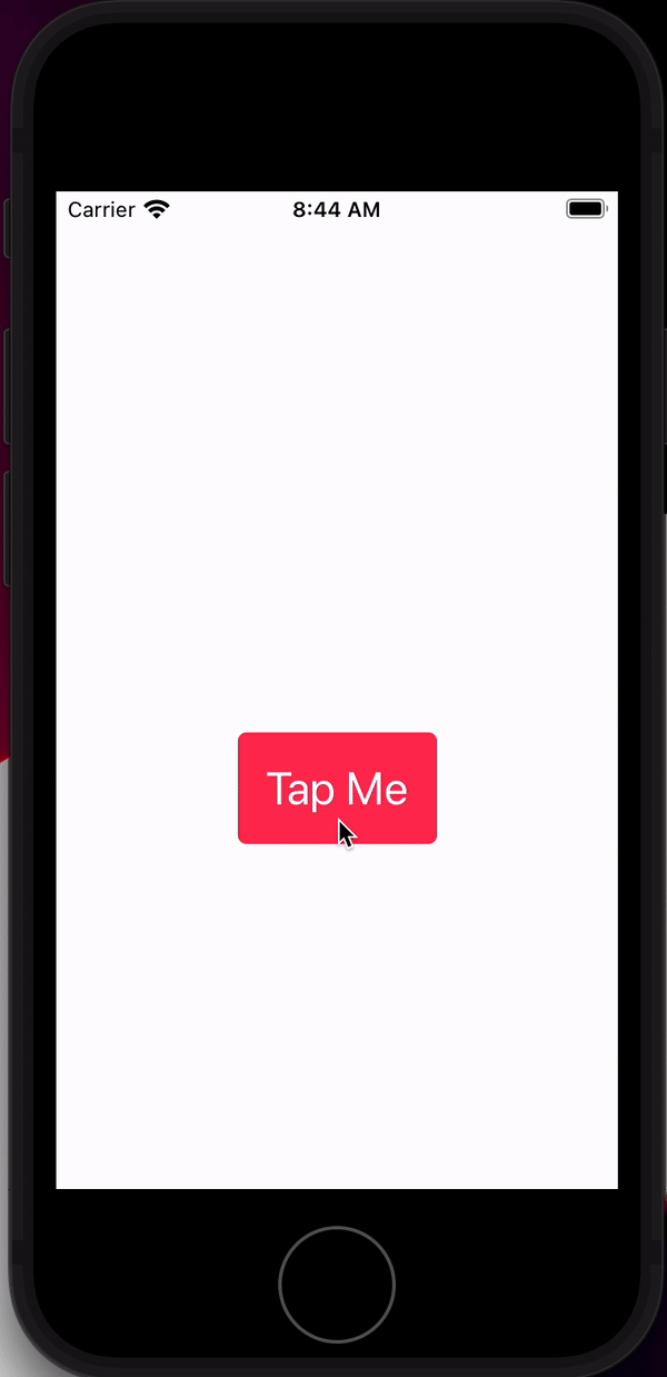
What if you want to configure a NavigationLink’s style like a button’s? You could use the ButtonStyle configuration the same way as you do with a Button:
struct ContentView: View {

    struct PinkButtonStyle: ButtonStyle {
        func makeBody(configuration: Configuration) -> some View {
            configuration.label
                .padding()
                .font(.title)
                .foregroundColor(.white)
                .background(configuration.isPressed ? Color.blue : Color.pink)
                .cornerRadius(5)
        }
    }

    var body: some View {
        NavigationView {
            NavigationLink(destination: DetailView()) {
                Text("Tap Me")
            }.buttonStyle(PinkButtonStyle())
        }
    }
}

struct DetailView: View {
    var body: some View {
        Text("Second Screen -- button pressed")
    }
}
You could also customize the NavigationLinks further by returning the entire child view in the ButtonStyle configuration:
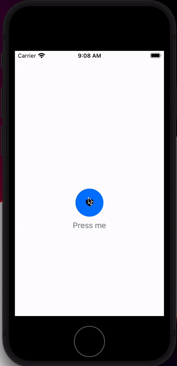
struct ContentView: View {

    struct NavLinkButtonStyle: ButtonStyle {
        let background: Color
        let pressedBackground: Color
        let imageName: String
        let text: String

        func makeBody(configuration: Configuration) -> some View {
            VStack {
                ZStack {
                    Circle()
                        .foregroundColor(configuration.isPressed ? pressedBackground : background)
                        .opacity(1)
                    Image(systemName: imageName)
                }
                .frame(width: 60, height: 60, alignment: .center)
                Text(text)
                    .foregroundColor(configuration.isPressed ? Color.gray : Color.black)
                    .fontWeight(.medium)
            }
            .animation(.none, value: configuration.isPressed)
        }
    }

    var body: some View {
        NavigationView {
            NavigationLink(destination: DetailView()) {

            }.buttonStyle(
                NavLinkButtonStyle(
                    background: .pink,
                    pressedBackground: .blue,
                    imageName: "heart.fill",
                    text: "Press me")
            )
        }
    }
}

struct DetailView: View {
    var body: some View {
        Text("Second Screen -- button pressed")
    }
}